Webchat Interactive Messages
The SmartAgent chat app supports a number of interactive messages which can be used to render buttons, forms, images and much more.
The messages are all supported by our chat app and related services including chat history, chat transcripts emailed to customers and chat transcripts sent to third party systems as plain text. The messages are all supported by our chat app and related services including chat history, chat transcripts emailed to customers and chat transcripts sent to third party systems as plain text.
The messages are sent in JSON format and can be sent from:
- a standard prompt in a contact flow
- a Lex bot in a contact flow
- the agent via quick responses
| Message Type | Message Example and JSON |
|---|---|
| TEXT | Standard messages can be sent in JSON format: |
{ "en": { "type": "TEXT", "text": "Please provide the council tax account number (this will be a 9 digit number starting with 8) ", "inputType": "TEXT" }}Setting the inputType allows for the customer to respond (see ‘inputType’ below).
| TEXT_QUICKREPLIES | Example of agent text followed by quick reply buttons displayed the customer: |
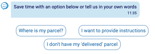
{ "en": { "type": "TEXT_QUICKREPLIES", "text": "Save time with an option below or tell us in your own words", "multilineQuickReplies": "true", "quickReplies": [ { "title": "Where is my parcel?", "payload": "Payload 1" }, { "title": "I want to provide instructions", "payload": "Payload 2" }, { "title": "I don't have my 'delivered' parcel", "payload": "Payload 3" } ], "inputType": "TEXT" }}When the title and payload are different, the customer will see the title, but the payload will be sent to Amazon Connect. An optional parameter of multilineQuickReplies can be added to have quick replies show up in a multi line format.
| QUICK_REPLIES | Example of quick reply buttons displayed to the customer: |
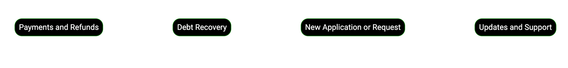
{ "en": { "type": "QUICK_REPLIES", "quickReplies": [ { "title": "Payments and Refunds", "payload": "Payload 1" }, { "title": "Debt Recovery", "payload": "Payload 2" }, { "title": "New Application or Request", "payload": "Payload 3" }, { "title": "Updates and Support", "payload": "Payload 4" } ], "inputType": "TEXT" }}| QUICK_REPLIES_MULTILINE | Example of quick reply buttons displayed to the customer in a multi-line format: |
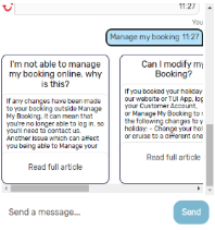
{ "en": { "type": "QUICK_REPLIES_MULTILINE", "quickReplies": [ { "title": "Payments and Refunds", "payload": "Payload 1" }, { "title": "Debt Recovery", "payload": "Payload 2" }, { "title": "New Application or Request", "payload": "Payload 3" }, { "title": "Updates and Support", "payload": "Payload 4" } ], "inputType": "TEXT" }}| CARD | Example 1 - Cards with images/links: |

{ "en": { "type": "CARD", "cards": [ { "imgURL": "https://prod-cdn-12059162352.s3.eu-west-2.amazonaws.com/images/Bexleylogo.png", "buttons": [ { "title": "Link", "url": "https://www.Bexley.gov.uk/appeal" } ] } ], "inputType": "TEXT" }}| CARD | Example 2 - Card with selection options displayed to the customer: |
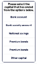
Here is the JSON to display a card in a ‘Get Customer Input Block’ in Amazon Connect, where we use an Amazon Lex Bot with relevant Intents and Utterances to accept the payload of the title selected:
{ "en": { "type": "CARD", "cards": [ { "title": "Please select the capital that has ended from the options below.", "buttons": [ { "title": "Bank account", "payload": "Bank account" }, { "title": "Bank society account", "payload": "Bank society account" }, { "title": "National savings", "payload": "National savings" }, { "title": "Premium bonds", "payload": "Premium bonds" }, { "title": "Premium bonds", "payload": "Premium bonds" }, { "title": "Other capital", "payload": "Other capital" } ] } ], "inputType": "TEXT" }}| CARD | Example 3 - Cards that disappear when customer selects an option: |
If you want the cards to be removed from the chat when the customer clicks an option, a boolean of collapseWhenSelected needs to be passed with the cards and set as true.
{ "en": { "type": "CARD", "collapseWhenSelected": true, "cards": [ { "title": "Please select the capital that has ended from the options below.", "buttons": [ { "title": "Bank account", "payload": "Bank account" }, { "title": "Bank society account", "payload": "Bank society account" } ] } ], "inputType": "TEXT" }}| CARD | Example 4 - Cards with a summary: |
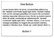
Cards may have a summary section (seen in the JSON below) that is cut off after 9 lines if buttons exist. If there are no buttons, the text summary element will be larger. This is currently used to give a summary of an article before users decide if they wish to view it.
{ "en": { "type": "CARD", "collapseWhenSelected": true, "cards": [ { "title": "One Button", "summary": "Lorem ipsum dolor sit amet, consectetur adipiscing elit, sed do eiusmod tempor incididunt ut labore et dolore magna aliqua. Ut enim ad minim veniam, quis nostrud exercitation ullamco laboris nisi ut aliquip ex ea commodo consequat. Duis aute irure dolor in reprehenderit in voluptate velit esse cillum dolore eu fugiat nulla pariatur. Excepteur sint occaecat cupidatat non proident, sunt in culpa qui officia deserunt mollit anim id est laborum.", "buttons": [ { "title": "Button 1", "payload": "Button 1" } ] } ], "inputType": "TEXT" }}Multiple articles can be sent in the array to create a scrollable list:
| ACCORDION | The multi-article display component allows multiple articles to be presented in an accordion-style list, where only one can be open at a time. Any number of sections can be added, each with a header and a body. It allows markdown, and there is an option for the customer to select if none are relevant. Example: |
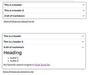
{ "en": { "type": "ACCORDION", "isKnowledgeBase": "true", "sections": [ { "header": "This is a header", "body": "Vini vidi vici.", "id": "id1" }, { "header": "This is a header 2", "body": "Alea iacta est.", "id": "id2" }, { "header": "A bit of markdown", "body": "# Heading\n* bullet 1\n* bullet 2 \n\nMy favorite search engine is [Duck Duck Go](https://duckduckgo.com).\n", "id": "id3" } ], "quickReply": { "title": "None of these are relevant to me", "payload": "None of these!" }, "feedback": { "positiveButton": { "title": "Yes", "payload": "Yes", "display": true }, "negativeButton": { "title": "No", "payload": "No", "display": true }, "text": { "title": "was this helpful?", "display": true } } }}The ‘quickReply’ is the option beneath the articles. The ‘title’ field is what will display on the chat. The ‘payload’ field is the message that will be sent from the customer to Amazon Connect if the option is clicked. If it is not set, it will default to being the same as the text.
| BIG_BUTTON | Big buttons can be used in a similar way to cards, but they are also used to display icons/images and are mainly used for menu options rather than pick lists or links. Example: |
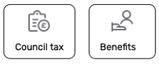
{ "en": { "type": "BIG_BUTTON", "buttons": [ { "title": "Council tax", "iconURL": "https://prod-cdn-12059162352.s3.eu-west-2.amazonaws.com/images/CouncilTax%402x.png", "payload": "Council Tax", "displayText": "title" }, { "title": "Benefits", "iconURL": "https://prod-cdn-12059162352.s3.eu-west-2.amazonaws.com/images/Benefits%402x.png", "payload": "Benefits", "displayText": "title" } ], "inputType": "TEXT" }}The ‘displayText’ field on each option determines whether the customer will see the title or the payload on their end. It can be set to ‘title’ or ‘payload’ and will default to ‘payload’ if not set.
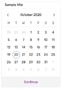
| DATE_PICKER | The DatePicker component let users pick a date by selecting a year, month and day from a calendar. It will return a date in DD-MM-YYYY format to the chat. Example: |
To render a DatePicker component use the ‘Get Customer Input’ block in Amazon Connect flows using ‘Text-to-speech’ or ‘Chat text’ and paste the following JSON:
{ "en": { "type": "DATE_PICKER", "nextAvailableDate": "28-10-2020", "title": "Sample title", "enableDatesInPast": true, "inputType": "TEXT" }}Parameters:
- type: “DATE_PICKER”: is required to render the component.
- title: Optional string, if set the text will show at the top of the box Date Picker e.g. “What is your moving out date?” or just “Date”.
- nextAvailableDate: Optional string (DD-MM-YYYY date) (default: today’s date), on initial load the Date Picker will automatically select this date
- enableDatesInPast: Optional boolean (default: true), true enables selection of dates before today’s date and false disables all dates before today’s date
The date picker will now call DATE_PICKER_RESPONSE once you select continue.
- DATE_PICKER_REPSPONSE will be called with something such as the following:
{ "en": { "type": "DATE_PICKER_RESPONSE", "selectedDate": "2024-07-08T22:00:00.000Z" } }| STAR_RATING | This will give the customer the ability to give a star rating out of 5. It will set the attribute sa-star-rating on the contact. The colour of the stars will pull from the global-dark-colour, or it can be overridden with star-rating-colour in the theme object. Example: |

A get-customer-input block should be set with the following text:
{ "en": { "type": "STAR_RATING", "numberOfStars": 5, "messages": [ { "text": "How satisfied are you with our service today?", "type": "TEXT" } ] }}The messages array can be used to send messages which will appear before the star component. The numberOfStars property can set the maximum number of stars, default is 5.
| ACCEPT_MESSAGE | The AcceptMessage component displays a themed prompt to the customer. Example: |
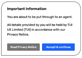
{ "en": { "type": "ACCEPT_MESSAGE", "title": "Important Information", "summary": [ "You are about to be put through to an agent.", "All details provided by you will be held by TUI UK Limited (TUI) in accordance with our Privacy Notice." ], "buttons": [ { "buttonTitle": "Read Privacy Notice", "buttonType": "secondary", "url": "http://www.google.com" }, { "buttonTitle": "Accept & continue", "buttonType": "primary", "payload": "Accept & continue" } ] }}Parameters:
-
title: The title of the message
-
summary: The body of the message. Adding an array of strings will separate them into paragraphs.
-
buttons: The button(s) applied to the message. Adding a url property turns the button into a link. The payload property fires off a new message and allows the user to
continue.
{ "buttonType": "MessageAcceptButtonType", "buttonTitle": "string", "url": "string", "payload": "string"}[]The theme of this component can also be configured including the:
- Border radius
- Border colour
- Primary button background colour
- Primary button text colour
- Secondary button background colour
- Secondary button text colour
Please contact us if you require configuration of these elements.
| HOLDING_STATUS | The HoldingStatus component displays a waiting message to the customer when the flow is generating a response. Example: |

{ "en": { "type": "HOLDING_STATUS", "holdingText": "Jenny the bot is thinking...", "showTypingIndicator": true, "text": "hello", "ttl": "120", "inputType": "TEXT" }}Parameters:
- holdingText:
string- The text to be displayed on the holding message - showTypingIndicator:
boolean- Whether the ‘typing’ animation should be displayed whilst this message is displayed on the screen - text:
string- Content of chat bubble (only shows if showTypingIndicator is false) - ttl:
number- Max duration to display the holding message for. If not set, will display until the next message or holding status is sent
| BATCH | This allows multiple messages of the above types to be sent at once. Example JSON: |
{ "en": { "type": "BATCH", "messages": [ { "type": "TEXT", "text": "We need to know your date of birth." }, { "type": "TEXT", "text": "Please select a date below." }, { "type": "DATE_PICKER", "nextAvailableDate": "28-10-2020", "title": "Sample title", "enableDatesInPast": true, "inputType": "TEXT" } ] }}InputType
In order to enable customer typing we must return inputType: “TEXT” from every message. You can also set it to default to that option by adding “defaultInputOn”: true to the customer chat config. See more here Connect Chat Pitfalls .
Many JSON chat features support the inputType setting as shown above. Example: ”TEXT” or ”SECURE” The following options are available:
| Value | Result |
|---|---|
| TEXT | Text replies only. The customer’s ‘Type a message…’ text input will enabled, allowing the customer to input text. |
| SECURE | "inputType": "SECURE" will only enter *** for any information inputted. This will only be for webchat viability and emailed transcripts. CTR data will not redact this information or change it. |
| DISABLED | "inputType": "DISABLED" will disable the text box for a customer |
| FILE_UPLOAD | Using a TEXT message type, the "inputType": must be set to "FILE_UPLOAD". Optionally you can set the uploaded file URL to an Amazon Connect attribute passing the following parameters: |
- attributeName : The name that we want to use to access the attribute in connect. Then can be accessed in the flow with $.Attributes.[ attributeName ].
- company : Name of the company. Used as part of a HTTP request to make an API call to set the attribute in AWS connect.
- contactID : Contact ID to determine against what flow the attribute will be set. (Can get from the flow using $.ContactId ). Used as part of a HTTP request to make an API call to set the attribute in AWS connect.
- instanceARN : Instance ARN, is the ARN of the account instance in use. Used as part of a HTTP request to make an API call to set the attribute in AWS connect.
- env : The environment where we want to set the attributes. Possible “env” are: dev, uat, beta, prod. Used as part of a HTTP request to make an API call to set the attribute in AWS connect.
{ "en": { "type": "TEXT", "text": "Upload a file", "inputType": "FILE_UPLOAD", "attributeName": "any-attribute-name", "company": "capitalps", "contactID": "$.ContactId", "instanceARN": "$.InstanceARN", "env": "uat" }}For this to work, {stage}-sa-chat-customer-config table containing your chat settings must include a fileUpload field with:
- A bucket name within the customer’s account for the attachments to be put to.
- A role ARN allowing the sa-apps account to assume into the customer’s account in order to perform the S3 put.
- A bucket region.
For example:
{ "en": { "type": "TEXT", "text": "Upload a file", "inputType": "FILE_UPLOAD", "attributeName": "any-attribute-name", "company": "capitalps", "contactID": "$.ContactId", "instanceARN": "$.InstanceARN", "env": "uat" }}For more information on setting up roles see: